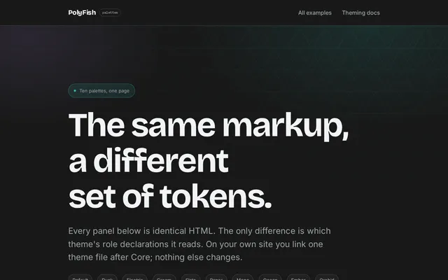
All eleven palettes
Default, Dusk, Electric, Cream, Slate, Paper, Mono, Ocean, Ember, Orchid and Sudo, compared on the same buttons, alerts, fields, tables and code.
The bundle · themes/*.css
Each example is a complete page you can open, read the source of, and copy. Ten are real-world sites, from a SaaS launch to a restaurant and a newsroom; the rest cover application screens, documentation, single components and every palette side by side.
Twenty-two complete pages. Every one is plain HTML with pf- classes and nothing
else: no custom stylesheet, no build step, and no JavaScript beyond the optional file. View
the source of any of them and what you see is what produced it.
Each card lists the modules that page loads. That list is the whole dependency — copy the markup, link the same files, and it renders the same way. For skeletons made to be overwritten rather than read, see the starters; for what real pages look like in the wild, the showcase.
The pack contains all thirty-one pages plus the stylesheets and fonts they need, with paths rewritten so it renders straight off your filesystem. No server required.
Eleven palettes on one page, each panel identical HTML. A theme is sixteen to twenty-two declarations that redeclare roles, a display face, a radius and the facet depth. No theme file mentions a component.
Default, Dusk, Electric, Cream, Slate, Paper, Mono, Ocean, Ember, Orchid and Sudo, compared on the same buttons, alerts, fields, tables and code.
The bundle · themes/*.css
Brand-new components and complete templates, to get something started quickly and to show what adding onto the framework looks like. Ten real sites, built only from what ships.
Complete pages of the kind you would actually ship, several on different themes. Each one is only pf- classes — no custom CSS anywhere in them.
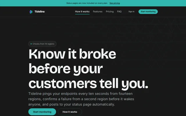
Announcement bar, split hero, feature grid, three-tier pricing, FAQ accordion, CTA band, column footer.
Core · Headers · Content · Footers · Space · Utilities
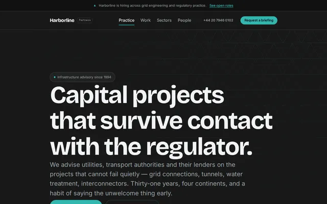
Credibility stats, practice grid, alternating case studies, a sortable sector table and a briefing form with a live counter.
The bundle
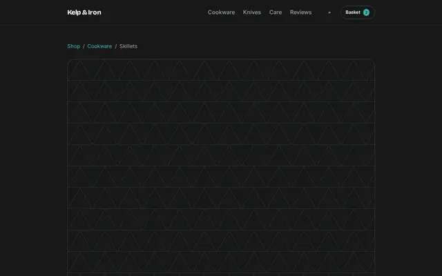
Snap-scrolling gallery, option cards, quantity group, spec tabs, review breakdown, related-product strip, mobile bottom bar.
The bundle
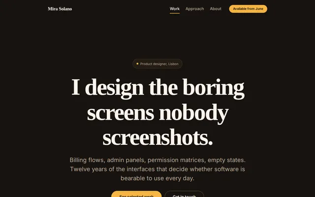
Oversized type, a project grid with stretched links, a short about column and a slim footer.
Core · Headers · Content · Footers · Space · Utilities
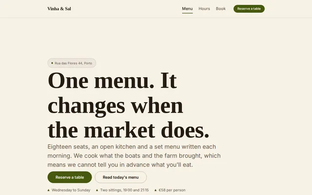
Photo hero, menu sections with prices, opening hours table, booking form.
Core · Headers · Content · Footers · Space · Utilities
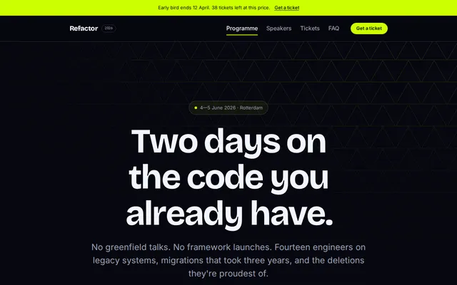
Date-led hero, speaker grid, a schedule table that stacks on a phone, ticket tiers.
Core · Headers · Content · Footers · Space · Utilities
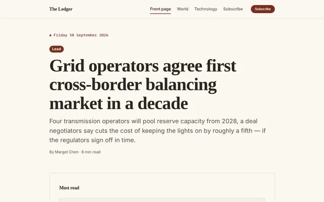
A daily front page on the paper theme: lead story, most-read rail, section grids and a newsletter signup.
The bundle · themes/paper.css
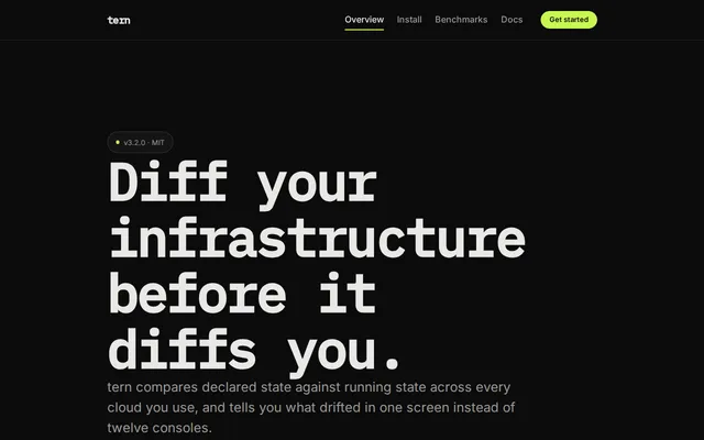
A CLI landing page on the mono theme: terminal hero, install tabs with copy buttons, a sortable benchmark table.
The bundle · themes/mono.css
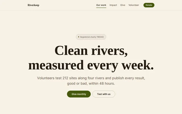
A charity site on the cream theme: centred mission hero, impact stats, donation tiers and a volunteer form.
The bundle · themes/cream.css
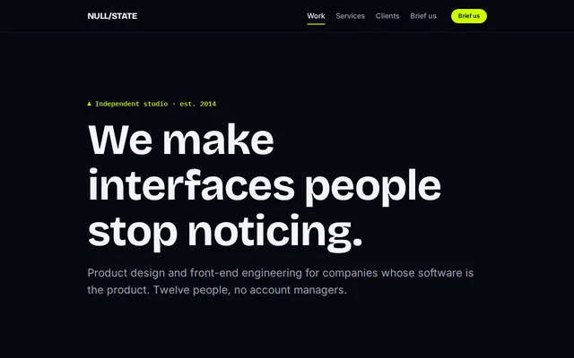
A studio portfolio on the electric theme: oversized type, case studies, a will/won't services split and a brief form.
The bundle · themes/electric.css
Common patterns for building sites and apps: existing components and utilities, plus a little custom CSS where the pattern needs it.
Interfaces rather than pages. These are the ones that exercise Components and Forms hardest.
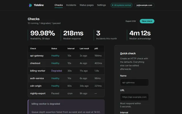
Sidebar shell, stat row, data table with sorting, progress meters and an empty state.
Core · Headers · Content · Space · Utilities
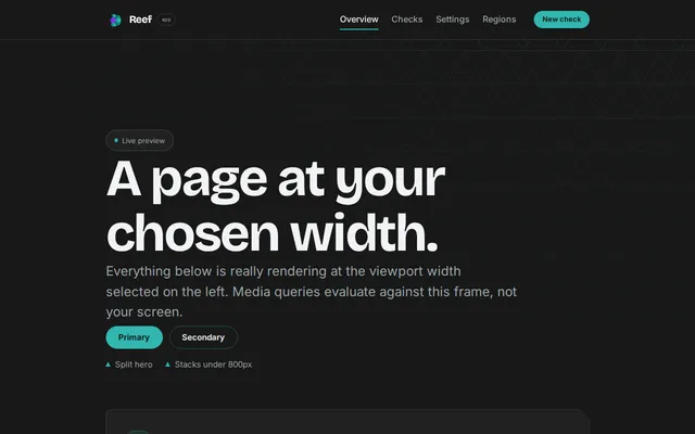
A whole product chrome: rail navigation, toolbar, tabs, drawer, toasts and a bottom bar on mobile.
The bundle
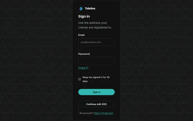
The smallest possible page — two modules, one centred panel, real validation states.
Core · Content · Space · Utilities
Long-form layouts — an article, a documentation page, a changelog — where the work is typography and rhythm rather than components.
Long-form pages, where the measure token and the prose rhythm do most of the work.
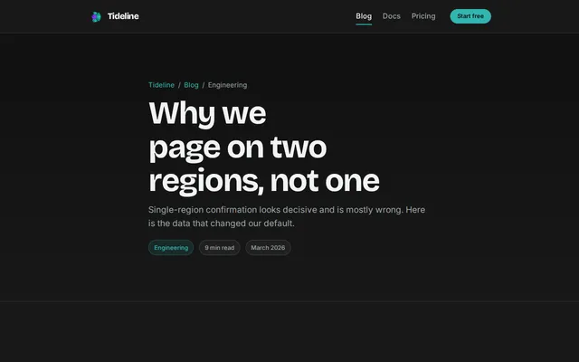
Page header with byline, prose at a fixed measure, pull quote, code sample, related reading.
Core · Headers · Content · Footers · Space · Utilities
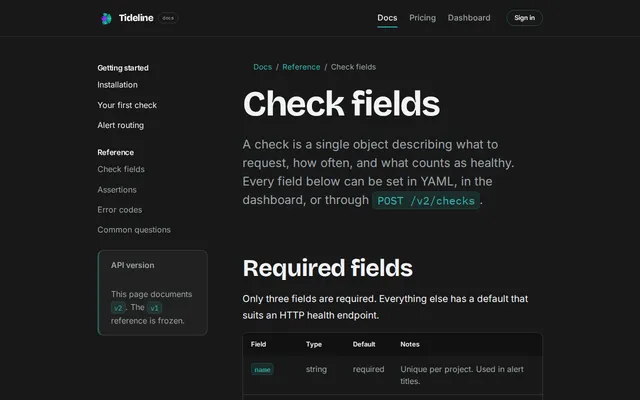
Sticky sidebar built from Core primitives, parameter tables, alerts and an accordion.
Core · Headers · Content · Space · Utilities
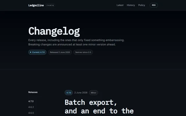
Sticky version column, tagged entries, and the layout this site's own changelog uses.
Core · Headers · Content · Footers · Space · Utilities
Examples that focus on implementing uses of the built-in components a single module provides. Load one file, see exactly what it gives you.
One module at a time, showing every variant it ships rather than a designed page.
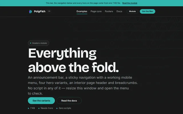
Every announcement bar, navigation and hero variant in the module, stacked for comparison.
Core · Headers · Content · Footers · Space · Utilities
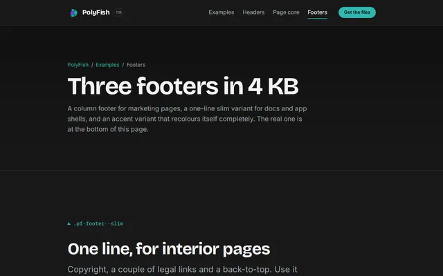
Column, slim and accent footers with link columns, social rows and legal bars.
Core · Headers · Content · Footers · Space · Utilities
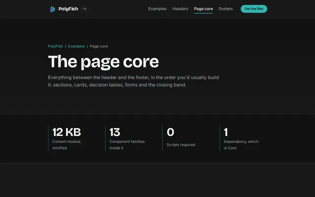
Sections, cards, plans, stats, tables, alerts, code blocks and CTA bands on one page.
Core · Headers · Content · Footers · Space · Utilities
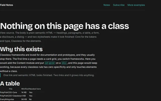
Not one class in the body. Plain semantic HTML — table, form, disclosure, a modal dialog — styled by Core and Classless alone, in 18 KB.
Core · Classless
The same markup and the same classes as its left-to-right counterpart. No mirrored stylesheet exists.
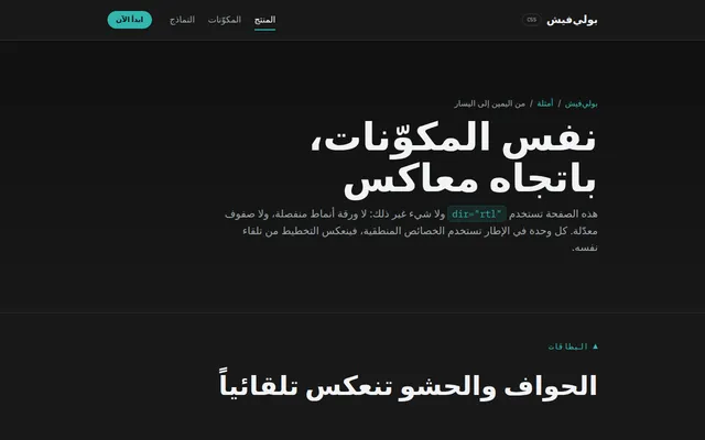
The same components under dir="rtl" with Arabic copy. No separate stylesheet and no overrides — every module uses logical properties, so the layout mirrors itself.
The bundle
How to use one
Open the example, view source, and copy the section you want. The classes are the same ones
in the class reference, and the <head> tells you
which modules to link. If a component looks unstyled after you paste it, you are missing its
module — that is the first entry in when it breaks.